| The New York Optimist March 2009 |
| February 19th and 26th, 2009 Chelsea Art Crawls Review The Up-Side of the Down-Turn, or The Wake-Up Call by Stephan Fowlkes The impact of the economic downward spiral is evident everywhere, and the art world certainly is not immune. But how does this manifest itself in relation to the arts? First off, there is the obvious: patrons are spending less on art. This is a bad thing. Galleries, who once were making a killing when we enjoyed a bull market in the eighties and nineties, are closing their doors. This is also a bad thing. People are re-evaluating their financial priorities, and luxuries--such as fine art--are often the first things to be cut from the budget: a very bad thing (particularly for artists). But there is also a positive outcome of this financial crisis. Galleries are re-evaluating the market, and in turn, are changing their approach to art-selling. Never in the history of the art market has there been such a great number of patrons, art buyers, collectors, not to mention artists being pumped out of the ever increasing number of MFA programs here and abroad. It was a beautifully symbiotic relationship: more artists provided greater choice, and more patrons supported these artists, and the middle-man-- the gallerists--all enjoyed the benefits of the financial boom of the past few years. The market was saturated, but demand fueled the supply. Everyone was happy. This is no longer the case. Sure, there are still those who enjoy the luxury of indulging in luxuries, but that number is shrinking every day. And of those, many are prudent and savvy enough to know the wisdom of a safe investment. That means the mid-career and established artists are continuing to sell, whereas the emerging market, the fresh-out-of-grad-school-artists are the ones to feel the pinch the greatest; they are unproven investments, risky, a gamble, and not a safe one at that. When the market was flush, there was room for everything, standards fell, and anything could be art, and could sell. Unlike a year ago, a giant pile of trash, or a hook on the wall will not easily find a home outside of the gallery, and apparently, the gallerists are wise enough to recognize this fact. As a result, they are rethinking their approach: the prior trend of seeking out the new, the novel, and the shocking (regardless of quality) has given way to a more conservative approach, relying on the tried-and-true standards of the art market. Lately, we’ve seen more of the big names in the art world being shown: Ellsworth Kelly, Louise Nevelson, Fred Sandback, Lisa Yuskavage and the like. But it is not only big names; even less recognized artists are being selected through a new filter: quality, skill, and beauty are no longer bad words, apparently. Imagine that; those qualities which stood for centuries as the standard, which were discarded in the past few decades in favor of novelty and shock value are now fashionable again. To me this is a welcome return. This gives me renewed faith in our gallerists, and ultimately critics, albeit their shrunken role in shaping the current artistic landscape. They recognize the desires of the market and respond accordingly. This is not to say that I am no longer seeing crap being passed off as art in the galleries; I am only seeing LESS of it, thank goodness. This seems most apparent in the field of painting. There is still abstraction, landscape, realism, surrealism, minimalist, figurative work out there, but it is being more conscientiously addressed and chosen. No more derivative, cliche, trite, all-too-referential of past artists’ work, or obviously a direct outcome of grad school intellectualism and theory. The past couple weeks in Chelsea presented me with some delicious painting, truly enjoyable to appreciate, drink in, get lost in and be challenged by. Is this the new “Recession-Proof School of Painting”? Hopefully, this trend--in the fickle, ever changing world of the art market--will take hold and become the standard for future evolutions in this field. Just because you have an MFA does NOT give you the right to do just anything and call it art. Until recently, this statement was questionable. The problem was, however, that people were buying that crap, justifying its existence: too much disposable cash was floating out there. Fortunately, the economy served as a wake-up call. One gallery that seems to have been immune to this folly, whose work consistently is of a calibre worthy of a Chelsea gallery is the Stephen Haller Gallery. Stephen Haller has unflinchingly stood by his aesthetic sensibilities which favor the traditional standards in painting--surface, technique, formal composition--regardless of the fluctuating trends. His stable of artists have consistently proven and defined his high standards, and this month is no exception. Gregory Johnston’s series of paintings, “Passepartout,” offers such an insight into the gallerist’s standards and exceptional eye. These paintings are lush, translucent, painterly, conscientiously conceived and exceptionally executed. Johnston commands his palette with his signature style of a painting within a painting. Compositionally, these works exist within a geometric--almost architectural--realm yet with a sensual, painterly surface, simultaneously providing great depth through the translucent layers of gradient colors. There is something very calming and Zen-like in these paintings, regardless of the energy they emit. Passepartout Gregory Johnston at Stephen Haller Gallery 542 W. 26th Street February 19-March 28, 2009 |

| Left Passepartout XIV 2009 Oil, alkyd on canvas 48 x 48 inches |
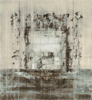
| Right Passepartout '08 2008 Oil, alkyd on linen 78 x 72 inches |
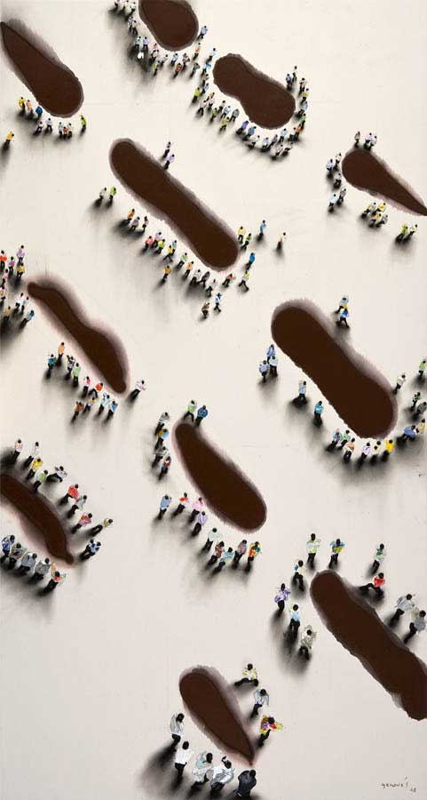
Juan Genoves’ show of recent paintings at Marlborough Chelsea offers a
very different aesthetic, though equally effective. His large canvases
present the viewer a bird’s eye view of crowds of people dislocated from
their surroundings, gathering upon the void of the blank canvas, in some
cases obstructed by painterly, compositional, vertical stripes of color.
From afar, each individual in these crowds looks painstakingly and
meticulously rendered, almost photo-realistic. Upon closer inspection the
viewer is confronted by the fact that these “people” are actually just multi-
colored blobs of paint with a black daub for the head and black legs added
with a light wash for the shadow. It is truly amazing how effective the
technique is: these figures seem so real as to pop off the canvas, partially
achieved through the physical mass of the blobs of paint. Not only that,
but even in this limited approach to each figure, the gestural properties of
each figure is remarkable--a sense of urgency in the stride or purpose in
the direction the figure is headed is abundantly clear. Is this a masterful
reduction of skilled figure painting or simply a remarkably effective use of
and understanding of his material? I don’t know, but the outcome works
brilliantly for me.
Recent Paintings
Juan Genoves at Marlborough Chelsea
545 W. 25th Street
February 19-March 21, 2009

Juan Genovés
Resquicios / Crack, 2008
acrylic on canvas on board
31 1/2 x 42 1/2 in., 80 x 108 cm
Resquicios / Crack, 2008
acrylic on canvas on board
31 1/2 x 42 1/2 in., 80 x 108 cm
| Juan Genovés Huellas I / Footprints I, 2008 acrylic on canvas on board 110 1/4 x 59 in., 280 x 150 cm |

| Juan Genovés Lineal I / Linear I, 2008 acrylic on canvas on board 59 x 110 in., 150 x 280 cm |
| If displaced people sans environment isn’t for you, how about environments void of the characters? Lui Shtini’s paintings at Van de Weghe Fine Art are cleaner, hard- edged paintings depicting objects and environments--scenes, really--offering a view into some surreal world where absurdity and some dark reality are clearly felt. Dali, de Chirico, and Magritte would be proud: ants feeding on dentures, chicken feet next to an electric pencil sharpener, an empty throne with articles including a necklace and a leather whip. These glimpses into some other world, though innocuous enough, sustain some chilling quality or presence, effectively eliciting a sense of discomfort. In these paintings, the subject matter takes precedence over the technique. The style is hard-edged, almost cartoonish, often with block color void of apparent brush stroke. Yet this apparent simplicity of technique in no way takes away from the psychological mood intended. Through its seeming innocence, the style manages even to boost the darkness of the allusions made within the work...enter at your own risk (though with my encouragement)! New Works Lui Shtini at Van de Weghe Fine Art 521 W. 23rd Street February 26-April 11, 2009 |


But what if you want the presence of people whilst maintaining
some deep, dark reality just beyond the limits of what is being
presented in the image, some sense of discomfort, all in one
painting? What if you want more than a blob to represent the
figure, a figure technically and skillfully painted, with a clear
understanding and grasp of traditional techniques of figure
painting? Maybe with some far more elaborate story lying just
under the surface? Then how about some mermaids, disformed,
decomposing, serene, morbid, and again, surreal. Then by all
means, check out Wei Dong’s new paintings at the Nicholas
Robinson Gallery. Masterfully rendered and executed, again with
clear skill over the material, Wei Dong presents us with mermaids in
various degrees of distress, though apparently unaware of their
predicaments: in “Hard Shoes,” an adolescent mermaid is casually
chipping away at the concrete-filled bucket encasing her tail whilst
enjoying a coffee and croissants with jam. Or “Interior View,”
where a mermaid is holding a cat on a leash, who happens to be
feasting on the mermaid’s entrails which have spilled to the floor--
and she is smiling lovingly at the cat. These images are haunting,
and make me think of something along the lines of illustrations to
Grimm’s fairy tales.
New Paintings
Wei Dong at Nicholas Robinson Gallery
535 W. 20th Street
February 26-April 4, 2009

| Wei Dong, Happy Moment 2008, Oil on Acrylic on canvas, 66 x 47 inches |
If the Dark Side isn’t for you, don’t worry! Head over to the Mike Weiss Gallery for “Ophelia,” new paintings by Piet van den Boog. Yes, there is reference to the
tragedy of Ophelia’s untimely demise, yet it is presented through such a beautiful painterly technique that any darkness is swept right under the rug. “In his latest body
of works on black steel, Piet van den Boog flawlessly succeeds at the seemingly unattainable task of taking melancholy, desperation and violence and finding in it not
only beauty, but understanding as well as peace....the remarkable renditions of splashing water in van den Boog’s works are intentionally reminiscent of our Ophelia’s
watery grave. This is the ultimate descent into madness, highlighting feelings of loss and rejection. For the artist however, the water is a place of comfort, a
sanctuary for his characters where they will finally let go and no longer feel; they will release all worry and all pain.” (Press release). Also, there are a couple self-
portraits on steel and lead, where the eyes are so piercing as to mesmerize or hypnotize. If you like painting and the traditions of painting, this show is the current
must-see!
Ophelia
Piet van den Boog at Mike Weiss Gallery
520 W. 24th Street
February 26-March 28, 2009


With all this in mind, it is abundantly clear that painting is not dead. However, it is possible that it is in transformation, redefining itself, as it has ever so many times
since its inception. I had more fun looking at this collection of works than I have had in a long time on these gallery crawls. If this is the result of the economic
down-turn, then I say we’ve found the silver lining. That this trend may continue! Beauty, talent, skill, technique, aesthetics...let these words be removed from the
blacklist. Let it be okay for something to be beautiful, and for you to say so without the fear of being criticized for being so shallow. Beauty is NOT a bad word!
The world would well do with more beauty. And that is my final word.
Stephan Fowlkes- sfowlkes@thenewyorkoptimist.com